According to
a recent Pew Research Center survey, 25% of USA adults believe that “there is no solid evidence that earth is getting warmer”. It's true that, if you carefully cherry-pick your data, you can claim that the temperature hasn't gone up in the last
N years, for ridiculously small values of
N. However, not only do you have to be
extremely careful in your cherry-picking, you have to be phenomenally (perhaps deliberately) ignorant not only of how data analysis works but also of how to look at a simple graph. Here's some data analysis and some graphs.
First, the quick summary (or “tl;dr” as the youngsters would say):
The blue points are bad (“noisy”) estimates. The red points are the good estimates.
The good estimates are greater than zero. The rate of change of global temperature is greater than zero. Earth is warming. Global warming is happening.
This graph deserves some explanation; it's a bit long, but worth it. (But if you want another tl;dr version, go down to the bottom of this post and look at the animated graphs in Figures 8 and 9.)
An Introduction to Data Analysis for Toddlers and Climate Science Deniers
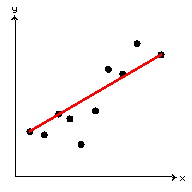
Suppose you've got a bunch of data. Maybe it looks something like this:
It seems pretty clear that there's a sort of trend in the data — as you move to the right (increasing
x), you move up (increasing
y). Maybe you want to draw a straight line through the data, perhaps to get an idea of how quickly you go up.
What does it mean to “draw a straight line through the data”? Here are three things that a toddler or climate science denier might do:
In part (a), there are straight lines between the data points — but not a
single straight line, as per the instructions.
In part (b), there is a single line, joining one end of the data to the other. However, the construction of this line
neglects all the other data. This line depends, in its entirety, on the vagaries of just two data points.
In part (c), there is a single straight line whose construction depends on all of the data.
You may have noticed that the slope of the line in (c) is somewhat larger than the slope of the line in (b). This is because the first point is above the line (c) and the last point is below it. You could choose two different points for method (b), for example, the two points adjacent to the endpoints. Here's the comparison (the two red lines are the ones from (b), the blue is the one from (c)).
As you can see, by carefully selecting points, you can make the slope larger or smaller than the line from part (c); in other words, you can cherry-pick your way to almost any desired conclusion. (A good way to justify your cherry-picking is to claim that certain data points are unreliable and so should be discarded.)
There are a few reasons why you might want to use each of the three methods
[1].
Table 1: Pros and Cons of the Line-Fitting Methods
| Method | Popular with | Pros | Cons |
| (a): Connect-the-dots | Toddlers and climate science deniers |
Overwhelms the reader, obfuscates the issues |
Pointless and wrong |
| (b): Join the endpoints |
Climate science deniers and other liars |
Lets you cherry-pick so you can tell a lie |
Wrong |
| (c): Valid analysis |
Honest people and responsible adults |
Useful valid information |
None |
(The reason method (a) is pointless is not merely that it is full of clutter, but that it is actually quite useless for either understanding the existing data or predicting new data. We've seen a
real-world example of this before, in which lots of excitement was generated by the “trend” of the last two points. The Pew Research Center survey analysis shows
another example.)
Sometimes, though, fitting a straight line isn't good enough; you might have data that look something like this:
These data look like they lie on two different straight line segments. There are ways to analyze things like this, too; one thing you can do is fit a straight line to the left half of the data, and another to the right half, and then you've got your two straight line segments. That's an enhancement
[2] of method (c).
The Global Temperature Data
Look at the data, from NASA, plotted in the figure below:
These are the global temperature anomaly data; there's one point for every month between January 1880 and November 2014 (inclusve). The global temperature anomaly is the global average of the deviation of a temperature station from its reference temperature. (You can add 14°C to the anomaly to get an annual average, but month-to-month that's not valid.)
Let's apply methods (a), (b), and enhanced (c) to these data.
Part (a), as predicted by Table 1, is rather messy and the data points are obscured by the line segments.
Part (b), as predicted by Table 1, is a graph of which climate science deniers would be proud.
Part (c) is useful and pretty much speaks for itself; the slope of the line on the left (before 1975) is 0.006°C/year and the slope of the one on the right (after 1975) is 0.02°C/year.
One could reasonably ask why two line segments is the right thing to do; why not three, or four, or…? Or is there something else we could do? Well, yes, there is.
The Moving Window
You can pick some date — say, January 1, 2000 — and look at everything during the ten years before then, since Jan 1, 1990. You can fit a line through those points, and calculate its slope, and that'll give you an estimate of the rate of change of temperature between 1990 and 2000. Or you can do that today, and get an estimate of the rate of change during the last ten years. This ten year interval is referred to as a window.
What if we want an estimate of the rate of change
right now? Can we look at today's temperature and compare it to yesterday's? Well, we could, but that would be pretty pointless, because day-to-day variations are all about weather, not climate. What about today and six months ago? There's that whole summer-winter thing (even though these are global averages, you can still see an annual fluctuation if you look at the Fourier series, probably because the land distribution between northern and southern hemispheres is not equal, so there are still seasonal variations). What about today and a year ago? Surely that wouldn't be seasonally dependent, right? Well, no it wouldn't, but even one year's variation is still dominated by weather (as you will see in the following graphs). You have to look over several years before you're looking at climate. But how many years? That's a good question, which leads us (finally!) to the explanation of Figure 1 (at the beginning of this blog post).
Choose some number
N of years (i.e., a window of
N years); here, we're choosing
N between 6 and 24. (We stopped at 24 because the estimate pretty much stabilized by then, as you'll see in Figure 9 below.) For each data point (i.e., each month), take the
N years' worth of data ending at that point, fit the straight line (using method (c)!), and get its slope. Plot that slope, as a function of time. (This method introduces a time shift of
N/2; that's why the animations in the figures below sort of look like they're moving to the right.)
Here's the sequence of these graphs, from
N=6 through
N=24.
The slopes are colour-coded (red means positive slope, blue means negative) for clarity or emphasis. Hopefully I shouldn't have to point out that there are a lot more positive points than negative.
You might point out that there are still a lot of positive slopes when
N is closer to 6, doesn't that mean we're cooling over short term, so isn't it possible that our climate right now is cooling?
No. Here's the same data, but this time colour-coded according to
N and overlaid on top of each other; the animation runs from shorter windows to longer.
It's pretty clear that, for shorter time scales (smaller
N, blue points), the rate of change is dominated by large swings (these, as mentioned earlier, are due to weather, not climate). It's also pretty clear that, when looking at longer-term rate of change (larger
N, green and red points), the large swings of the blue points are pretty much noise.
Here's another way of saying that: just by looking at the data, you can see that the shorter-term averages fluctuate a lot, and consistently cancel each other out over a decade or so. They're very much like the pointless clutter from method (a) and, for the purposes of longer-term prediction, should be ignored.
In other words, when you ignore the climate science deniers' cherry-picked points and you look at useful data, the rate of change of the global temperature is positive.
There's no doubt. Anyone who claims otherwise hasn't looked at the data and is just repeating what others have claimed, is an idiot, or
is a liar. I suspect the majority of the 25% of USA adults who don't believe the earth is warming are in the first category, listening to those in the third category.
Notes
- ^ You may be wondering what the algorithms behind these methods are. (a) is simply sorting by the x coordinate and then connecting adjacent points; (b) is simply finding the minimum and maximum x coordinates and connecting the points or, if that doesn't give you the answer you want, find points close to the ends that do; and (c) is almost always done by linear regression, which involves postulating a line, computing the sum-squared error (take the differences between the y coordinates of the data and the line, square them, and add them all up), and minimizing that error, a process which can be done with explicit closed-form equations. (An alternative to (c) is minimizing the sum of the absolute values of the errors, which is a bit more difficult.)
- ^ One way to construct this two-part estimate is to postulate the location of the “break-point” in the graph, and minimize the sum-squared error of the piecewise linear graph. That minimization is as easy as normal linear regression; what's more difficult is choosing the break-point to minimize the error over all possible break-points, which is probably best done numerically.


No comments:
Post a Comment
Commenting might not work. You can try and see what happens, who knows, it might work. (It'll show a message “Your comment was published” if it worked.) If it didn't work, try hitting the “Post Comment” button again. Still didn't work? Hit it harder this time! (Seriously. It seems to work the third time, and then always after that, unless you clear some browsing data. I'm trying to fix it.)